Quick Look of Messaging App UI
I use messaging app everyday, whatsapp, Facebook messenger, gtalk, web and mobile. The UI of different apps looks natural to me and never tried to “see” the design of it.
Recently I am working on a messaging UI with a screenshot designer gave me. When I try to imagine how will this design looks like with real chat usage, I am sure there are lots of details not included in the design so I take a deeper look of the messaging app I used everyday.
When you received a message, you usually can see sender information (name / avatar), message content, and sent time. And for the message you send, you may also see deliver status (sent/fail/received/read), retry when fail.
Here are some elements besdies those basic thing.
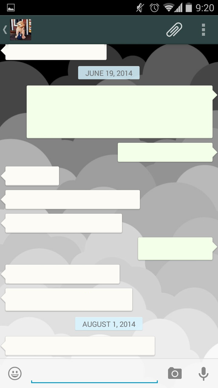
Date header
To avoid displaying the date in every message, a common handling is to have a “Date header” to divide the messages, and whatsapp also added a sticky header for the date.
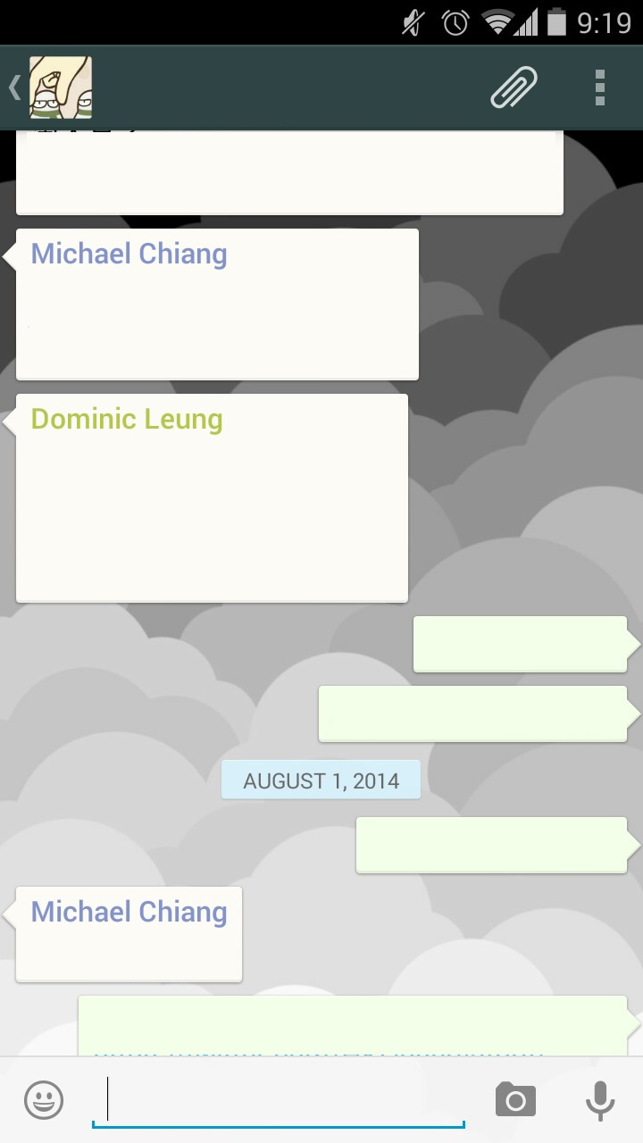
1-to-1 message VS group chat
In whatsapp 1-to-1, it only shows the name in action bar and does not include it in the content, it totally makes sense because you know who you are talking to when you are in that page. And for group chat, as more then one people you are talking to but the incoming messages are all aligned left, it is necessary to have the name before each message.
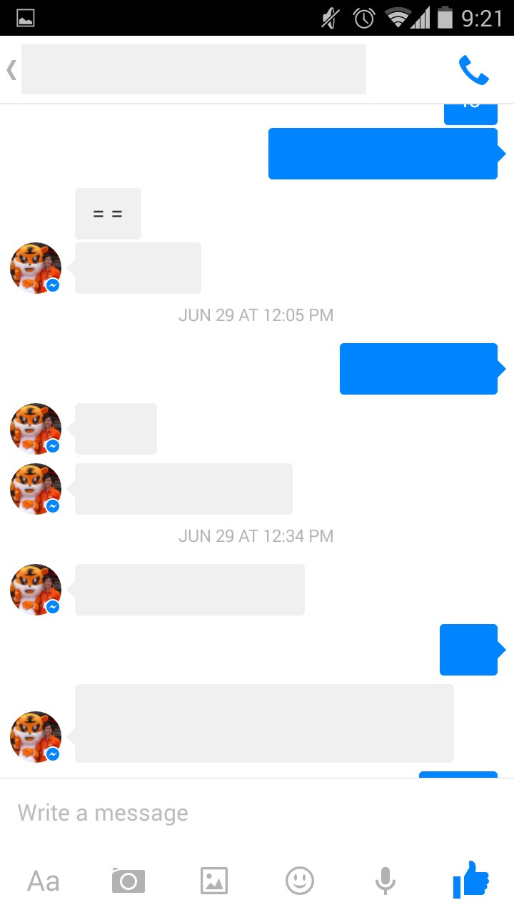
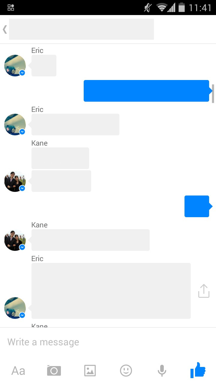
Facebook messenger also has similar logic of adding name but it is outside the bubble.
Message grouping
Most messaging app styled the messages with talk bubbles, it is interesting to see that some of them are not simply a bubble.
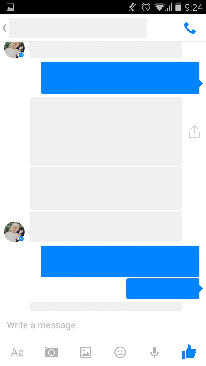

For Facebook messenger, I found that when continuous messages from same person is grouped, avatar is only showed once, in both 1-to-1 or group message. However, sometimes messages are not grouped, I guess it only groups messages within a short time.
For whatsapp, it groups continuous messages to one single bubble, my first reaction is it would be fun to write a list view adapter for that, need to have 3 item types for one message (start, middle, end) and the types may change when new messages come in, eg. end –> middle.
Understand what’s behind it
It is easy to reference other’s UI, but it is also important to understand why they handle information that way and even we will not handle like them, make sure we aware of it.