How I See Android Design Guideline
To make a good Android app, the design is important for sure, but is following the design guideline enough? I am a developer not a designer, but still want to share some thoughts on current design guideline.
Current design guideline is not complete
Mobile app design changes very fast. To make the app stand out, people put lots of effort to stay on top of the design trends, they improve existing UI, and sometimes create new. And when the public accepted that design, it may become part of the design guideline. For example, navigation drawer (sliding menu) and pull to refresh. The drawer is now in the design guideline and is even supported in support library. Pull to refresh is still new but you can see that Google have their own twist and is using in gmail and google plus app.
Case studies
Here are some apps that I think they are in a good direction of expanding the design guideline.
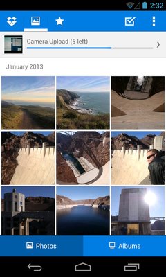
Dropbox
I like the way they put the tab in actionbar and combined with the app logo. You can say it does not follow the design guideline, but in my opinion, it works better, and as long as the style consistent with the Holo theme, I would say it is a good design. However, I don’t like they put the second level tab in the bottom, may be they can try using other style of indicator.
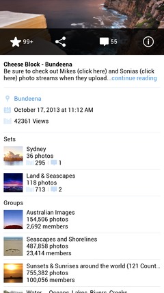
Flickr
Another UI I want to talk about is the slide up panel. I dont see many people discussing it, is it not popular? Not really. Google plus and Flickr are using it already. Comparing to navigate to another view, using gesture to drag out another view sometimes gives better user experience, you dont lose your current view and you have a chance to abort the action (slide out a little bit and close it back).


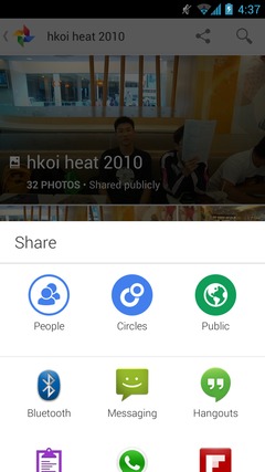
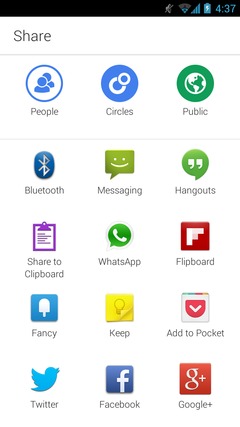
While I write this article, I found that there is a new “Photo” app from Google in my application list, what supprised me is, the new share dialog. Beside the share dialog and action bar share provider, Google created a new share interface with the slide up panel. I like it.

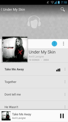
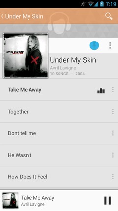
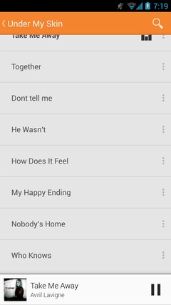
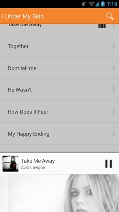
(Google) Play Music
The fading action bar is very impressive and definitely will be a trend. In the app, it has transparent action bar so you can see the whole image, and when you scroll down, it fade in to solid color to make the bars stand out. For more detail, Cyril Mottier wrote a good article on this.
And beside fading, blur effect is also coming. I think it is still quite computation heavy in some lower end device, but it should not stop you using it :p


Keep changing
Design guideline will keep changing. Limiting yourself in the guideline does not mean your app is good, sometime you need to study your users and expand the guideline yourself. Developer/designer should not be afraid to use UI that is not in design guideline, as long as it is good, it will be in the guideline.
Futher reading
- New in Android(KitKat)
- Google’s Android Apps Look Boring – And It’s a Good Thing
- Four Android App Design Guidelines You Should Break
- (I dont agree on some of his points, may write another post on this)
- https://github.com/ManuelPeinado/FadingActionBar
- https://github.com/ManuelPeinado/GlassActionBar
- https://github.com/umano/AndroidSlidingUpPanel